How can we help you?
Configure your websites for different device layouts to suit your business needs.
When you have set up different device layouts, and you change the structure of the desktop page layout (for instance, adding another strip to the page), you will see an orange dot on the page header for the device layout option that looks similar to the orange dot that prompts you to save a project:

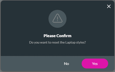
In this example, a laptop layout has also been configured. The orange dot reminds you that the structural change you made on the desktop layout may affect the other device layout.


Note:
You can click the OK button. If you click the Clear notification button, you will not be reminded again.
Make sure that you view the changes on the other device layouts and confirm that everything is as you would like it. When clicking the Save button, the message above will be shown again. If you are satisfied with the layout, you can click the Clear notification button.
As an alternative, you can do the following:

Note:
The message below is shown for the following device layout options:
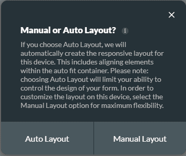
If you choose Auto Layout, we will automatically create the responsive layout for this device. This includes aligning elements within the auto fit container. Choosing Auto Layout will limit your ability to control the design of your form.
It is suggested that you use the Auto Layout as Titan adds an autofit container to make sure that the information is displayed from the top down in a contained manner.
Click the Manual Layout option for maximum flexibility. Manual layout uses the responsive AI and you can make changes as you require.
For best practices on how to build your page, refer to Web Project Structure Changes.


