How can we help you?
Users access web projects from different devices, including desktops, laptops, tablets, and mobile phones. Each device has a different screen size, orientation, and available space, so a layout that works well on a desktop may not work as well on a smaller screen.
Without device-specific layout control, users may need to zoom, scroll unnecessarily, or interact with elements that are not positioned correctly for their device. This can make forms, portals, and other web experiences harder to use.
Device layouts help keep the project clear, usable, and consistent across screen sizes while still allowing each version to be adjusted for the device it is viewed on.
Titan Web lets you configure separate device layouts for your project, so the design can adapt to desktop, tablet, and mobile views.
You can adjust how elements are positioned, sized, and displayed for each device layout while keeping the same project structure. This helps you create a better user experience across devices without having to build separate projects for each screen type.
Use Device Layout to control how your Titan Web project appears across devices and ensure users can view and interact with it correctly, no matter where they open it.
Learn more about the different device layout options.
Note:
It is not necessary to change any of the layout options, as all Titan projects use Responsive AI by default. The project will automatically adapt to the end user’s device size. When you preview your project on different devices, Titan automatically adjusts the layout to fit the screen dimensions.
It is suggested that you create the entire project and change the device layouts only at the very end.
Warning:
Once you select a device layout option, it becomes disconnected from the desktop layout and creates a standalone layout. Changes made to a standalone layout will not affect the desktop layout and vice versa. You will have to manually make changes on a standalone layout if you change anything that should affect the whole project.
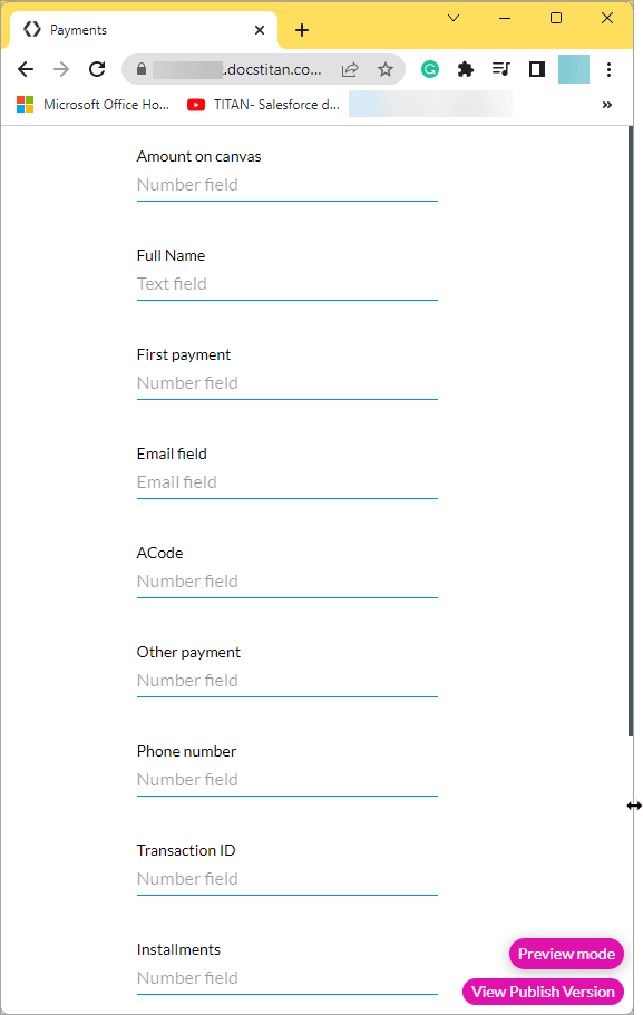
You must edit the site link to preview how the content will display on different devices.

The preview screen will auto-adjust when you resize it by dragging the screen smaller or bigger.
Note:
When you change the layout to a tablet or mobile device in the builder, Titan automatically changes your project to be displayed in a single column.
Note:

Note:
The Responsive AI toggle switch is on by default. Titan doesn’t change the structure of your project, it just makes it smaller to match the device.

Note:
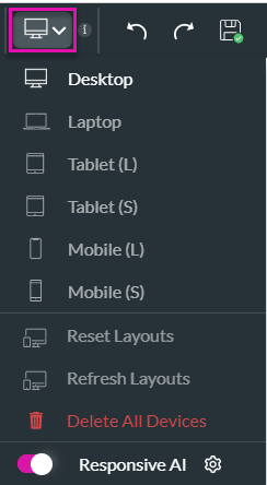
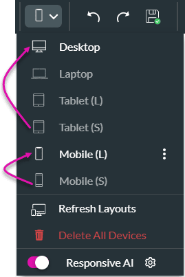
When you make a selection, that option refers to the previously defined device layout.
For instance, when setting the Tablet (S), the Titan system will refer to the Desktop device layout to display the small tablet layout. However, when setting the Mobile (S), the system will refer to the Mobile (L) device layout to display the small mobile layout.
Note:
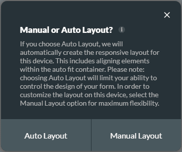
This message is shown for the following device layout options:
If you choose Auto Layout, we will automatically create the responsive layout for this device. This includes aligning elements within the auto fit container. Choosing Auto Layout will limit your ability to control the design of your form.
It is suggested that you use the Auto Layout as Titan adds an autofit container to make sure that the information is displayed from the top down in a contained manner.
Select the Manual Layout option for maximum flexibility. Manual layout uses the responsive AI and you can make changes as you require.

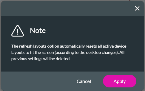
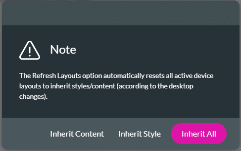
If you make changes to the desktop layout and you want those changes to be applied to all the other devices as well, use the Refresh Layouts option.

Note:
The refresh layouts option automatically resets all active device layouts to fit the screen (according to the desktop changes).
All custom changes on each device layout will be deleted.
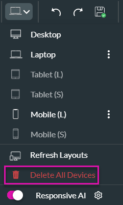
You can delete the configuration for different devices.
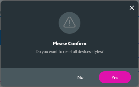

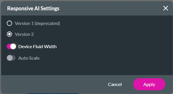
All Titan projects use Responsive AI by default. However, you can make manual changes.
Note:
Refer to the two screens below. The top screen shows the canvas layout when the Device Fluid Width toggle switch is off. The bottom screen shows the Device Fluid Width toggle switch on.

All the elements are positioned to fit the width of the screen.
Note:
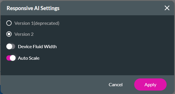
Auto-scaling is more flexible and can make small adjustments to elements based on screen size changes, while fluid width mainly focuses on repositioning elements based on the screen width.
Auto-scaling is commonly used when working with high-resolution devices such as 2K and 4K screens.
For best practices on how to build your page, refer to Web Project Structure Changes.
On this page